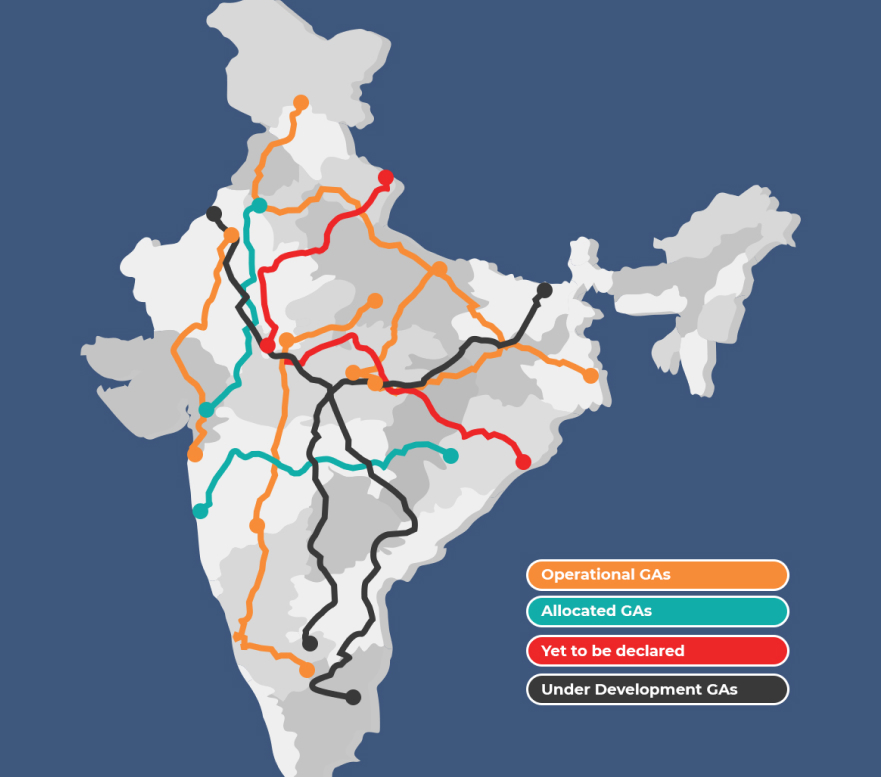
Our interactive solution was christened Third Eye: the decision to get the help of big data analytics lead to its conceptualisation in the form of a highly interactive Data Visualisation GIS platform, where a user can see a map which represents all the geo-spatial data overlaid with the pipeline information, in an easily managed representation
ADANI THIRD EYE PROJECT
GIS Mapping & Data Management forGas Pipelines
Mapping Adani Gas’ Country-wide and Intra-City Natural Gas Pipeline Network for the Industrial, Commercial and Domestic sectors, and Analysis of Volume & Sensor data across the network for Adani Gas and its competitors.
Our Solution

In this online gis mapping portal a user can also see the comparative data of Adani and its competitors. All information is mapped down to the State, County and City boundaries, with pipelines and service zones color-coded distinctly for easy visualisation. The solution also pin points the exact location of the LNG terminals along with their status represented by different colors.


Ravi Mundra
Senior Manager IT

Our Take OnAdani
While the collection and dissemination of the data itself we relatively easy, the platform needed to represent a lot of data points, GPS values and map / boundary related data in an easily comprehensible manner for the user. Hence, we realised that we were dealing with a Data Visualisation problem rather than a Data Collection or Analysis issue.
Accordingly, we tested different data representation models using Tableau and obtained End-user feedback on the same, before finalising the presentation layer for the portal.
ResultsAchieved
Since it has been launched, Adani Transmission is thriving. With 11000 ckms of lines approved and more than 2000 ckms of lines under development, we sincerely believe that we have had our small part of play in Adani’s success!